
Boost your language expression and comprehension skills with the educational app Tuvi, designed for the training and rehabilitation of people with aphasia.
TUVI

Overview
What is aphasia?
It is a language disorder caused by a failure in the nervous system. A communication problem that carries with it a social issue. This total or partial incapacity implies relational difficulties in the lives of those who suffer from it.
Problem Statement
Currently, it is estimated that there are 2 million people worldwide suffering from aphasia. Of these, 20% to 40% suffer from aphasia due to a disruption in blood circulation in the brain, directly affecting language skills. 80% result from a stroke.
Solution
An app-game that focuses on teaching people with aphasia to speak again, using a methodology based on repetition and constant practice.
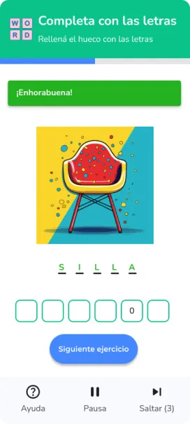
It includes exercises of reading short texts with a voice recognition system to capture and correct the words recorded by users, providing instant and accurate feedback.
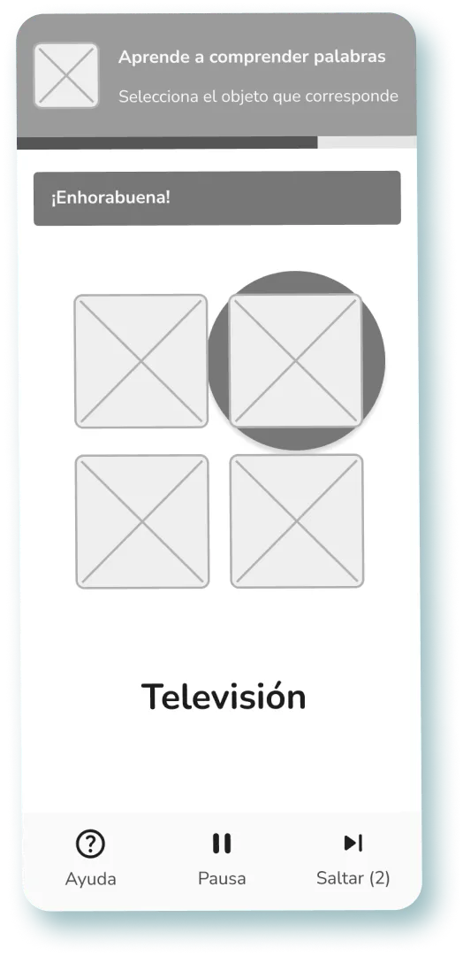
It incorporates matching and association exercises, which provide users with a visual way to associate words and concepts.
Design Process

Building visual solutions
In this project, I was responsible for the visual design alongside another designer. Together, we began building high-fidelity wireframes based on the previous research provided by the UX team.
Because aphasia is a brain-related issue, as UI designers, we aimed to create a simple interface with minimal cognitive load to help these individuals learn to navigate society better without feeling discriminated against.
We took into account design patterns related to gamification because we believed that through gaming, we could incentivize users to continue learning.
Benchmark and design patterns
We used three educational apps as reference that have a great impact on the market: Duolingo, Elsa, and Drops.

Design & Prototype
After conducting a benchmark of applications related to learning through games, we began to build low-fidelity wireframes that would shape our product.

As the app aims at assisting individuals with language comprehension issues, we decided it would be optimal to allow pausing exercises that require more comprehension time, as well as skipping them if the user wishes, with a limit of 3 intents to encourage the user to keep trying.
Being playful with UI design
We started creating the logo and color palette. The logo was inspired by a focus on aphasia users. We took the universal icon of a human being as a reference and played around with different shapes.
The main colors chosen for Tuvi are shades of blue, as this color is associated with many positive qualities such as calmness, trust, stability, and serenity.


Motion & Animation
We decided to implement more dynamic interactions because the MVP required it, as our users need constant feedback from the system in order to improve their speech and comprehension abilities.
In the sections involving interaction with the games, we chose to display both mistakes and successes within the same user flow, rather than as a separate step after completing the exercise.
This way, we aim to demonstrate that as UXers, we are committed to scaling the product's traceability and optimizing user performance through simple and necessary interactions.


Wireframes
High-Fidelity
Onboarding


Pronunciation exercises


Choose the correct object.


Spell out the word correctly.


Reflections
This project helped me emphasize my designs centered around individuals with disabilities, specifically aphasia in this case.
It wasn't easy to achieve a simple and intuitive interface focused on adults with this syndrome. There were many doubts about whether the registration within the app should be completed by a caregiver or a person who fully understood the objectives for which the app would aid in language rehabilitation.
Personally, I believe we have achieved it despite many challenges ahead.
- Thorough understanding of the difficulties of people with the aphasia syndrome and how it hinders everyday life.
- Lessons learned based on how other applications implemented learning in a simple and user-friendly way.
- Allowing learning based on trial and error and continuously improving the dynamics of the educational exercises.


